ORBITA DESIGN SYSTEM
Category
Design System
Year
2022-2023
An inside look at Orbita's libraries
construction and my design process

About Project
Orbita is the Design System of Prisma Medios de Pago, a multi-brand and multi-device library. Built in Figma and mirrored in a frontend repository with React, it empowers internal users with components that adapts to every project in the company while create a visual and functional ecosystem through an unify language for UX, IT & Product.
Used by
5 products
16+ Designers
30+ Developers
4+ Libraries
Styles & Components
Patterns & Templates
Icons
Illustrations
Based in
Figma
React JS documented
in Storybook
Year
2022-2023

Context
Context
A web components library created by an external team was being used. As the internal UX and development team formed, usability and accessibility errors were detected in the components, making it essential to review their functionality and visual appeal. Thus, a team was formed to create the company's Design System, consisting of 2 designers, 1 content designer, and 3 frontend developers. The Design System already had a name, and that name was Orbita.
A web components library created by an external team was being used. As the internal UX and development team formed, usability and accessibility errors were detected in the components, making it essential to review their functionality and visual appeal. Thus, a team was formed to create the company's Design System, consisting of 2 designers, 1 content designer, and 3 frontend developers. The Design System already had a name, and that name was Orbita.
At this point in the story, I joined the company as a UI designer, my first role dedicated to creating libraries within the product.
At this point in the story, I joined the company as a UI designer, my first role dedicated to creating libraries within the product.
APPROACH
APPROACH
Creating a solid basis
Creating a solid basis
With the aim of setting a common quality standard, we established the visual and functional principles that would govern our Design System and any visual proposals made by the team.
With the aim of setting a common quality standard, we established the visual and functional principles that would govern our Design System and any visual proposals made by the team.
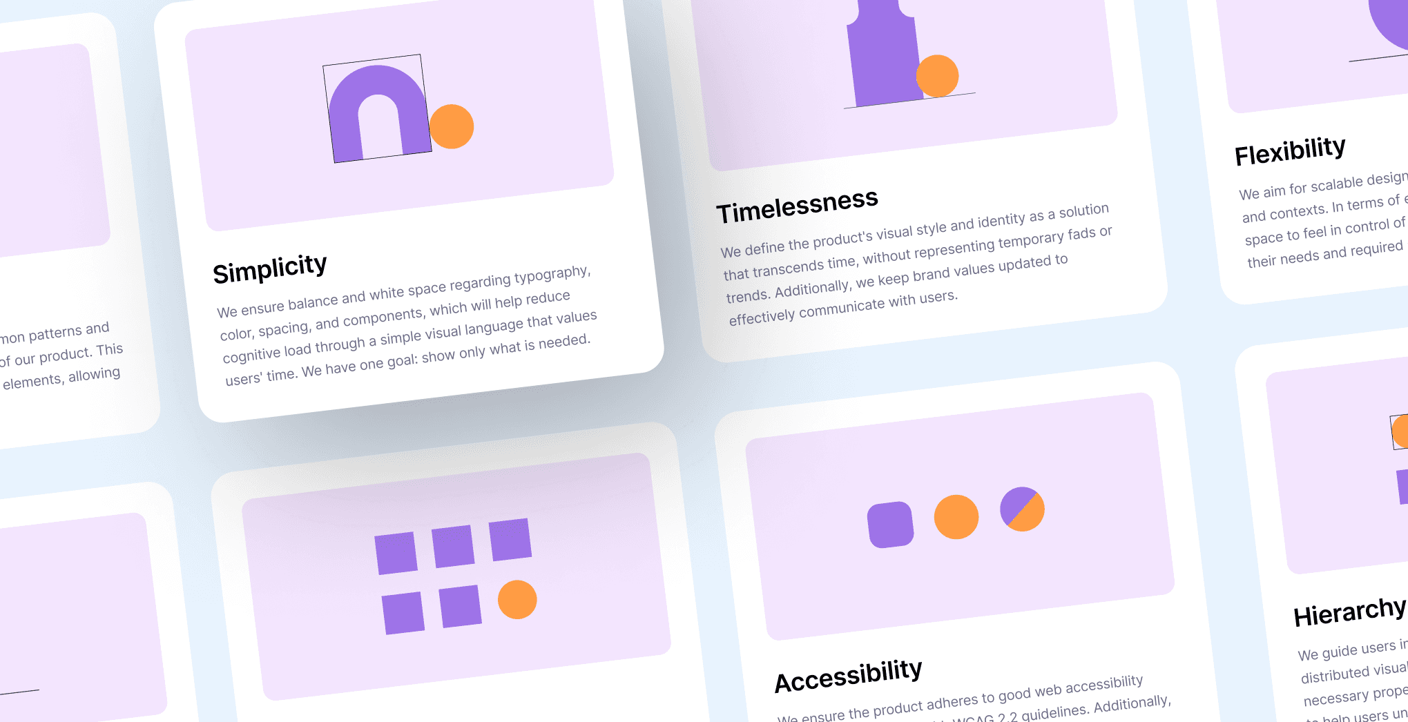
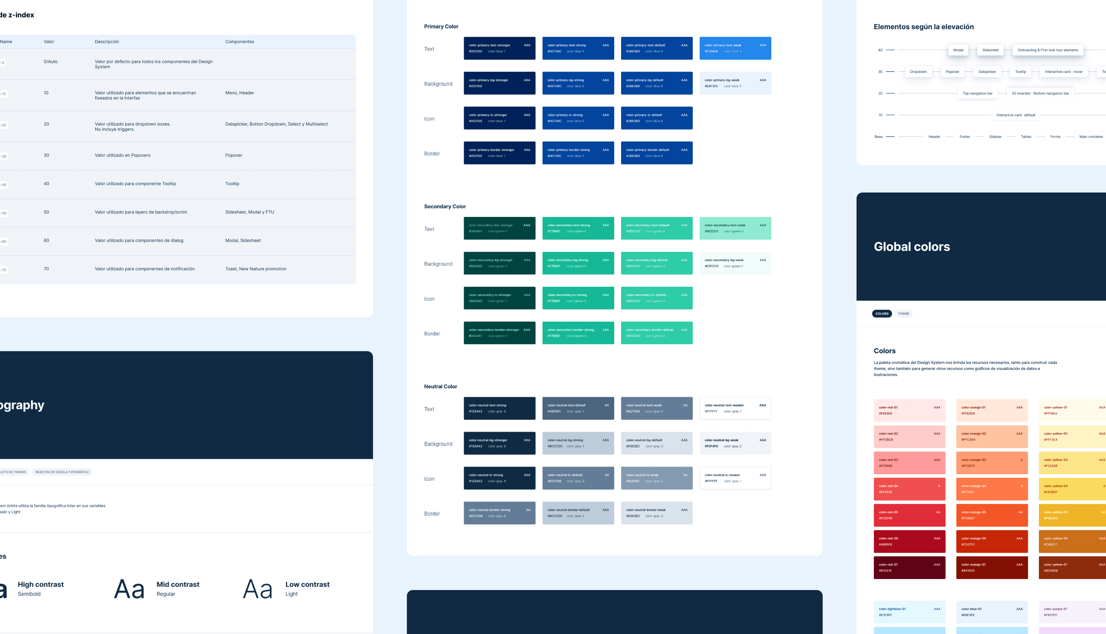
At the same time, my colleague and UI partner in crime was generating what would be the styles for our library. A comprehensive and flexible set of foundations to work across multiple products and devices. The set includes:
Global and semantic colors
Typography
Spacing
Grids
Border stroke
Border radius
Opacities
Our biggest challenge with the foundations was to make the set flexible enough to switch between more than one theme or product. The result was very solid, and to this day, the first set of agnostic tokens is still in use. Additionally, we knew that one product would play a more significant role in Orbita's adoption, so we had to emphasize that product more during style creation, allowing Orbita to coexist with the previous library. After all, we knew that with the token system, we could implement modifications with minimal effort.
Our biggest challenge with the foundations was to make the set flexible enough to switch between more than one theme or product. The result was very solid, and to this day, the first set of agnostic tokens is still in use. Additionally, we knew that one product would play a more significant role in Orbita's adoption, so we had to emphasize that product more during style creation, allowing Orbita to coexist with the previous library. After all, we knew that with the token system, we could implement modifications with minimal effort.
Prioritizing success
Prioritizing success
Following an audit of the main products that the Design System would cover, we began prioritizing components based on their usage. We started with the smallest or atomic components (like buttons, checkboxes, inputs) and then moved on to more complex components.
Following an audit of the main products that the Design System would cover, we began prioritizing components based on their usage. We started with the smallest or atomic components (like buttons, checkboxes, inputs) and then moved on to more complex components.
In total, by the end of that quarter, we would have designed a total of 32 components, of which approximately 30% would be coded and uploaded to a repository. The tools used throughout this process included Figma, Github, and Storybook.
In total, by the end of that quarter, we would have designed a total of 32 components, of which approximately 30% would be coded and uploaded to a repository. The tools used throughout this process included Figma, Github, and Storybook.
Result: A set of 32 components built in React JS, multi-brand, and multi-device ready for using in the company's products.
Result: A set of 32 components built in React JS, multi-brand, and multi-device ready for using in the company's products.

Documenting Everything
Documenting Everything
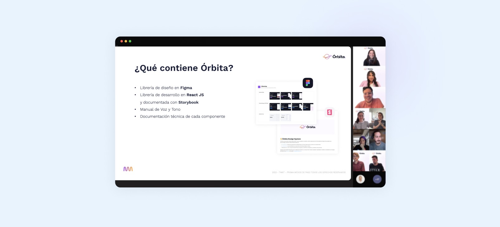
While creating the components, we also created functional documentation intended for both our Orbita development team and the Product Designers who would use the components in their designs. Defining a documentation standard took several ideation meetings and iterations until we assembled a template that included:
While creating the components, we also created functional documentation intended for both our Orbita development team and the Product Designers who would use the components in their designs. Defining a documentation standard took several ideation meetings and iterations until we assembled a template that included:
Component, states, and variables: Here, we also added base components, if required.
Functionality: It comprises a description of the component with its usage and behavior, its anatomy, differences between variables, device-specific changes, and best practices for usage and content.
Specs for development: Spacings, development annotations, and token usage.
After each component was developed, we went through a visual and functional QA phase to validate that the development met approval requirements and exhibited the same behavior as designed.
After each component was developed, we went through a visual and functional QA phase to validate that the development met approval requirements and exhibited the same behavior as designed.
Adoption and seeking ambassadors
Adoption and seeking ambassadors
Working on Design Systems taught me that creating and publishing the library is just the beginning.
Working on Design Systems taught me that creating and publishing the library is just the beginning.
Once the style libraries, components, and icons were in place, we proceeded to inform the UX team about Orbita, its benefits, and how to use it. This was one of the most crucial stages since Product Designers would act as the early adopters and main ambassadors of the Design System, as they were the ones responsible for migrating to Orbita in each of their projects.
Once the style libraries, components, and icons were in place, we proceeded to inform the UX team about Orbita, its benefits, and how to use it. This was one of the most crucial stages since Product Designers would act as the early adopters and main ambassadors of the Design System, as they were the ones responsible for migrating to Orbita in each of their projects.
Moreover, as we explained how to use Orbita, we made improvements to flow documentation and file organization. But I'll leave that for another case study ;)
Moreover, as we explained how to use Orbita, we made improvements to flow documentation and file organization. But I'll leave that for another case study ;)
Result: We became mentors and guides for the design team, which required us to understand the products, their features, and oversee all functionalities globally. We positioned ourselves as the leading team for product visual experience, aiding coherence and consistency.
Result: We became mentors and guides for the design team, which required us to understand the products, their features, and oversee all functionalities globally. We positioned ourselves as the leading team for product visual experience, aiding coherence and consistency.
Results & impacts
Results & impacts
Building visual and frontend solutions nearly 3 times faster, allowing the design team to focus on improving the user experience.
Enhanced collaboration between designers and developers, accelerating handoff processes.
Improved digital accessibility of our products through the migration of each component.
Saved time in understanding component functionality due to documentation.
Increased Figma knowledge within the design team.
Enhanced visual and functional consistency of products, contributing to a positive brand perception.
ZOOM IN TO MY PROCESSES
ZOOM IN TO MY PROCESSES
Library organization
We went through various stages of Figma library organization to align with Figma's new features.
We went through various stages of Figma library organization to align with Figma's new features.
One month post-launch - 2022
A few months after launch, we noticed that designers had difficulty finding components. So, we transitioned from an approach based on segmenting by component complexity (atomic components, molecules, and organisms) to segmenting them by usage (foundation library, component library, and icon library).Post Config - 2023
Once I tested Figma's variable functionality, Órbita transitioned from having different libraries per product (using the Swap Library function to switch between foundations) to having a centralized styles and components library with more than one mode for each product used.Inclusion of design patterns - 2023
While the Design System don't have a documentation tool yet, we strive to leave usage guidelines for each component in Figma, with a similar structure for components. With the arrival of design patterns to the library, I reviewed the library division scheme and proposed a structure based on usage and the metrics provided by Figma. This is the structure we are using today.

Creating components
Many components in the library were created by me, and I must say it's the task I enjoyed most during my first months in Design Systems. What's my process? It always depends on the component's complexity and role in the product, but to simplify it into steps:
Many components in the library were created by me, and I must say it's the task I enjoyed most during my first months in Design Systems. What's my process? It always depends on the component's complexity and role in the product, but to simplify it into steps:
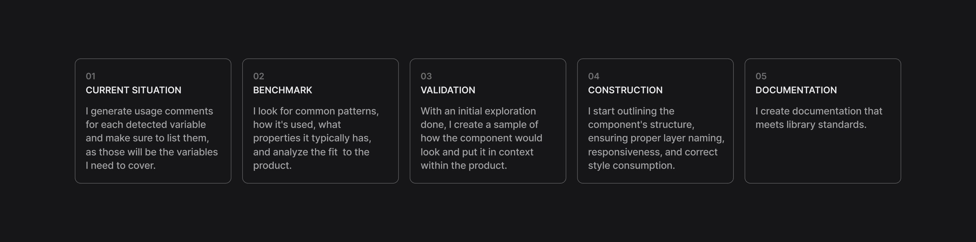
It's almost never a linear process since validation stages often lead to research and iterations. But these different stages ensure that the component meets the product's needs and doesn't deviate from the development team's roadmap, which is usually more defined than the design roadmap.
It's almost never a linear process since validation stages often lead to research and iterations. But these different stages ensure that the component meets the product's needs and doesn't deviate from the development team's roadmap, which is usually more defined than the design roadmap.
After creating the component in design, I pass it through a review with the rest of the Design System designers, and then it goes to the development team, who assess the required effort and prioritize it in their tasks.
After creating the component in design, I pass it through a review with the rest of the Design System designers, and then it goes to the development team, who assess the required effort and prioritize it in their tasks.

Gratitude
To my colleagues from Design ops at Payway: Ro Trejo and Pau Martinez. Thank you for teaching me every day ✨
To my colleagues from Design ops at Payway: Ro Trejo and Pau Martinez. Thank you for teaching me every day ✨
PORTFOLIO
CHECK OUT SOME MORE

Motion
Product Design
Design System
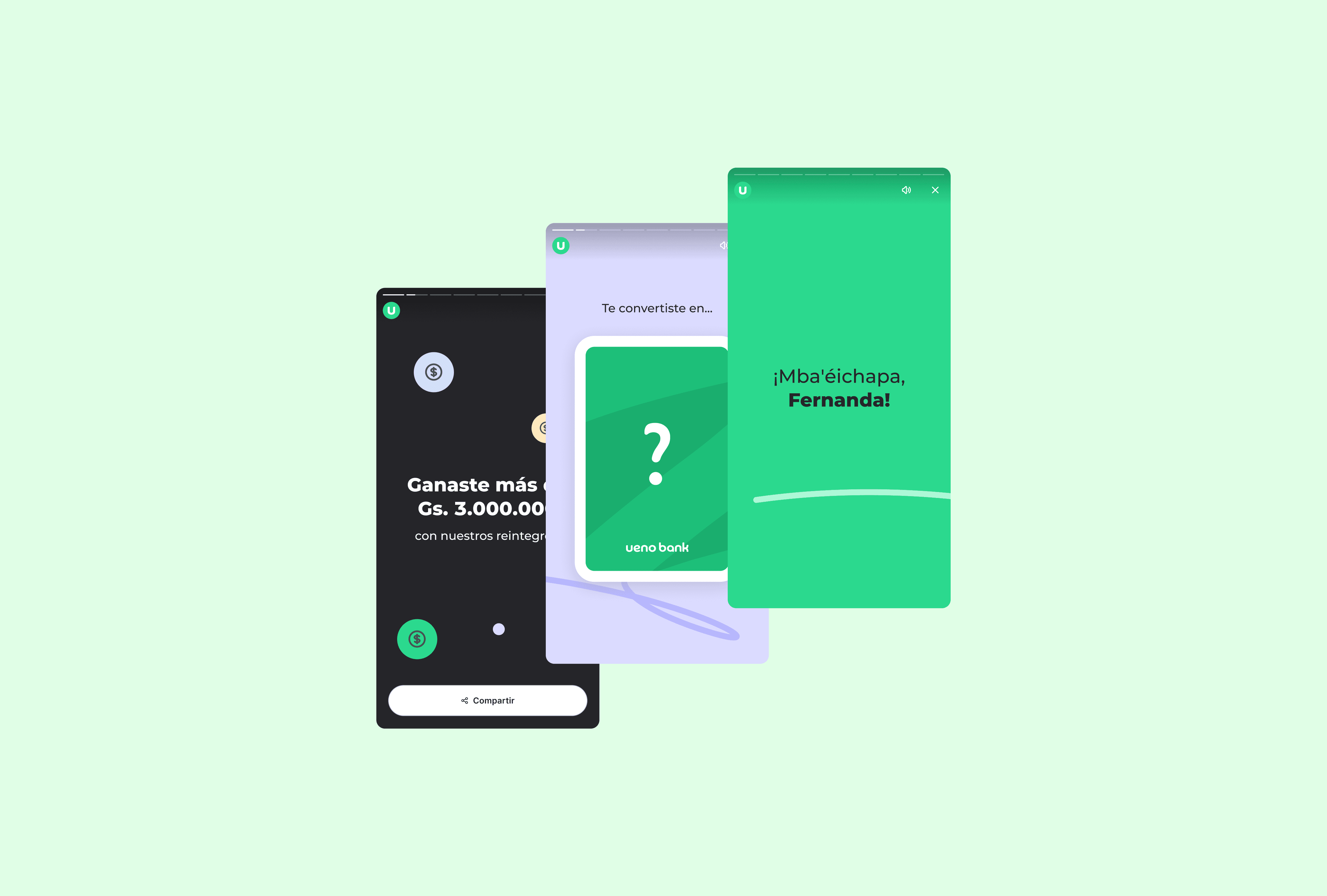
2024 Wrapped
2024 Wrapped
2024 Wrapped
Coming soon
Motion
Product Design
Design System
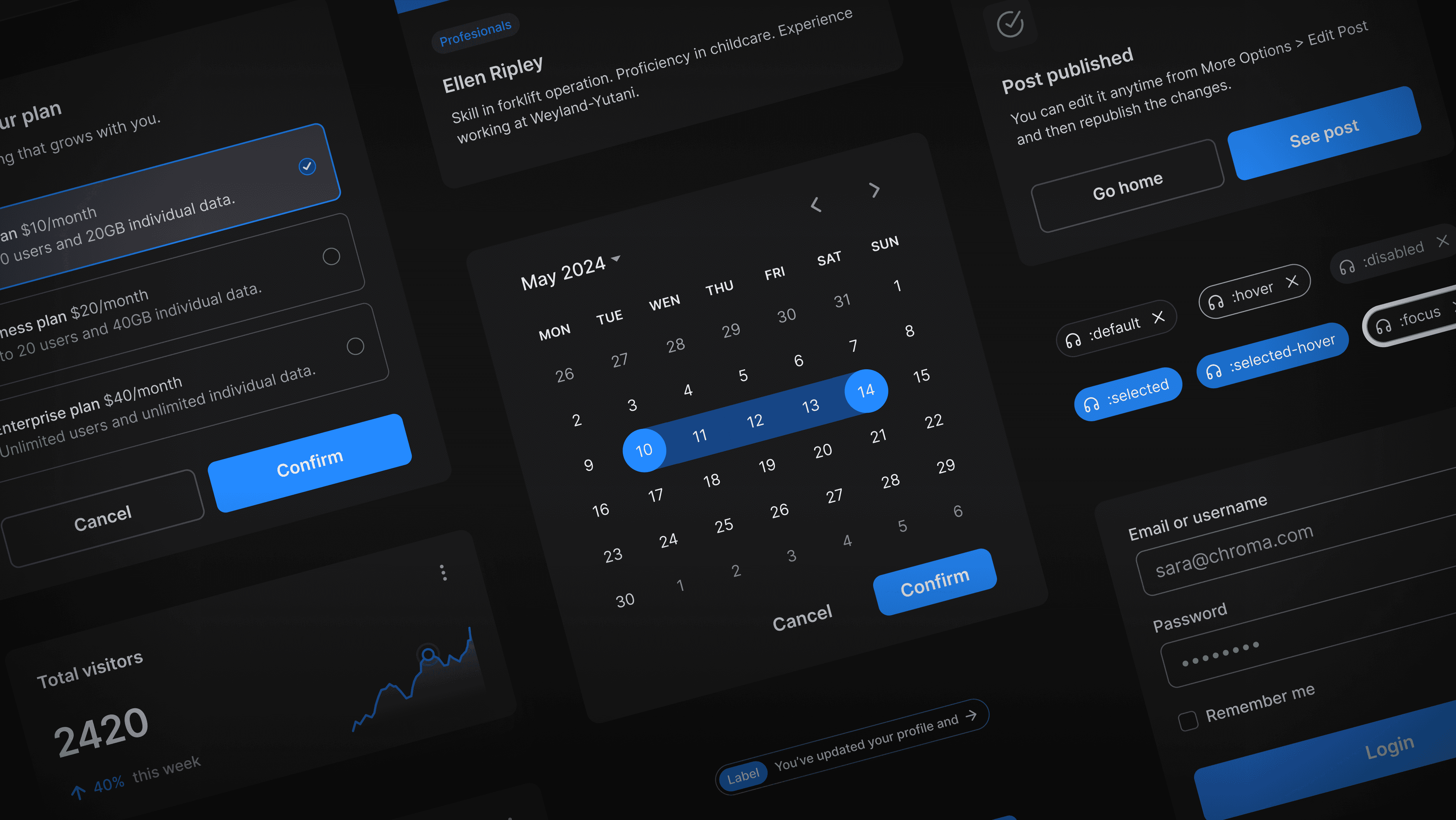
Design System
Motion Design
Accessibility
Design System
Motion Design
Accessibility
Design System
Motion Design
Accessibility
HAVE A PROJECT
IN MIND?