chroma ui library
Category
Design System

About Project
Just as chroma reveals the essence of a tone, a design system embodies the essence of a vision, of a shared purpose. Just as chroma distinguishes the clarity of a hue, a design system defines the coherence and harmony of an experience.
Chroma UI achieves a balance between aesthetics and function, a result of the meticulous research and development process invested in its creation.
Project
Personal Side
Project
Content
+200 Tokens
2 Themes
+21 Components
6 Web Templates
Based in
Figma
Duration
3 months


The big question, where to start? My goal with this project is also to provide a theoretical framework for everything I have been learning through practice and execution at my job. That's why one of the things I'll focus most on is searching for texts and articles that can address my needs.
Therefore, the first step I will take is to generate a repository of references that will allow me to take references, compare, and find common patterns in the base components of a library. This database will serve me as a repository since the design process is never linear. This means that we will continuously revisit, enrich, and validate what we are designing at any stage of the process.
To achieve this, I created a table of references in Notion that includes many Design Systems, UI Kits, and useful resources such as UI Guidelines, OpenUI, and Component Gallery, which compile and compare information by component.This benchmarking allowed me to define a scope of the 21 most used components to serve as a starting point for any digital project or product.
To achieve this, I created a table of references in Notion that includes many Design Systems, UI Kits, and useful resources such as UI Guidelines, OpenUI, and Component Gallery, which compile and compare information by component. This benchmarking allowed me to define a scope of the 21 most used components to serve as a starting point for any digital project or product.

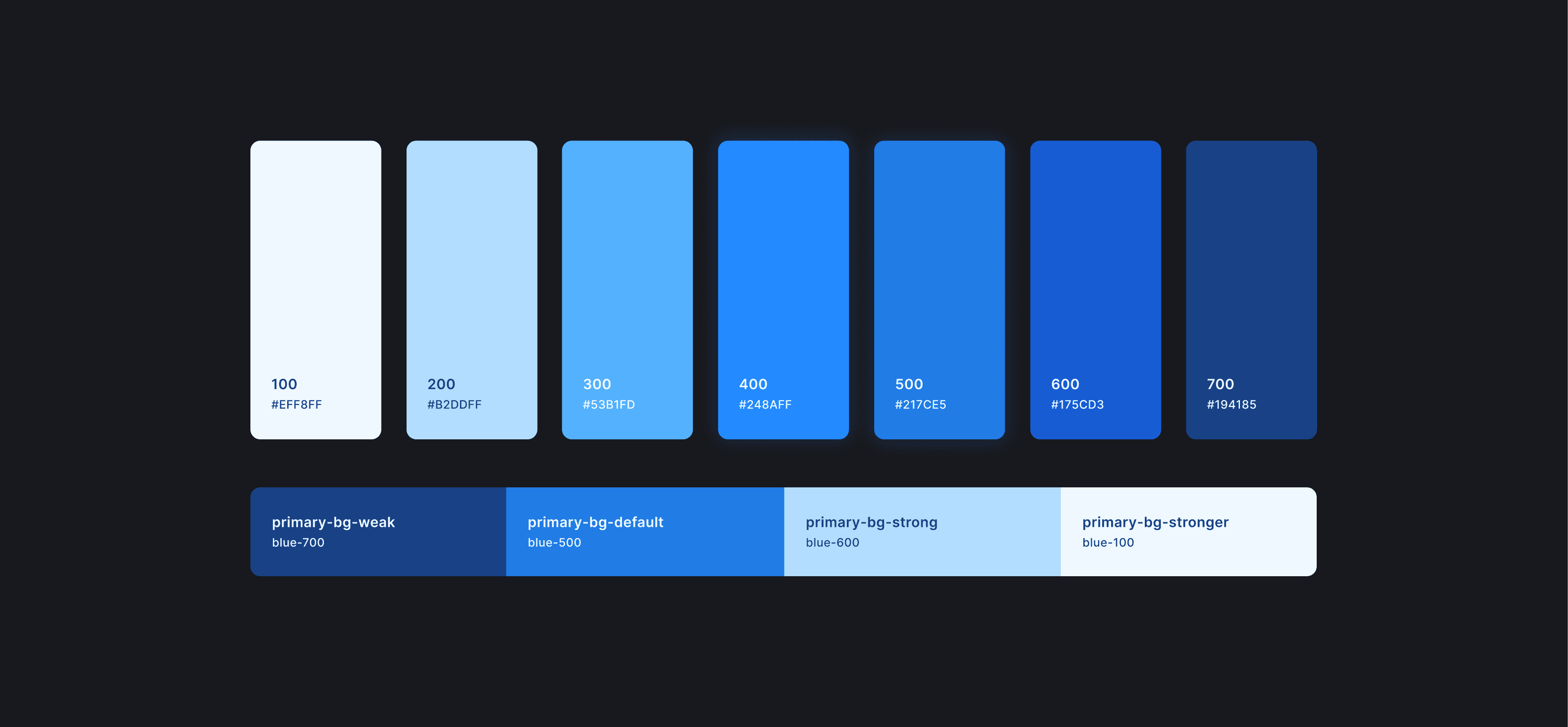
Color: I created a color system that includes a palette of 9 colors, including Gray, which will serve as primitive colors. I then created the semantic color slots that will reference or alias the primitive colors, to define primary, secondary, neutral, and feedback colors for text, background, icon, and border.
Typography: I generated specific tokens for size, letter spacing, font weight, and line height, and then assembled the styles divided according to their function, being Title, Body, Caption, and Overline.
Spacing: Spacing distances based on an 8px Grid.
Border radius: Various border radii that will allow sufficient flexibility for the components.
Border stroke: 3 sizes of border stroke.
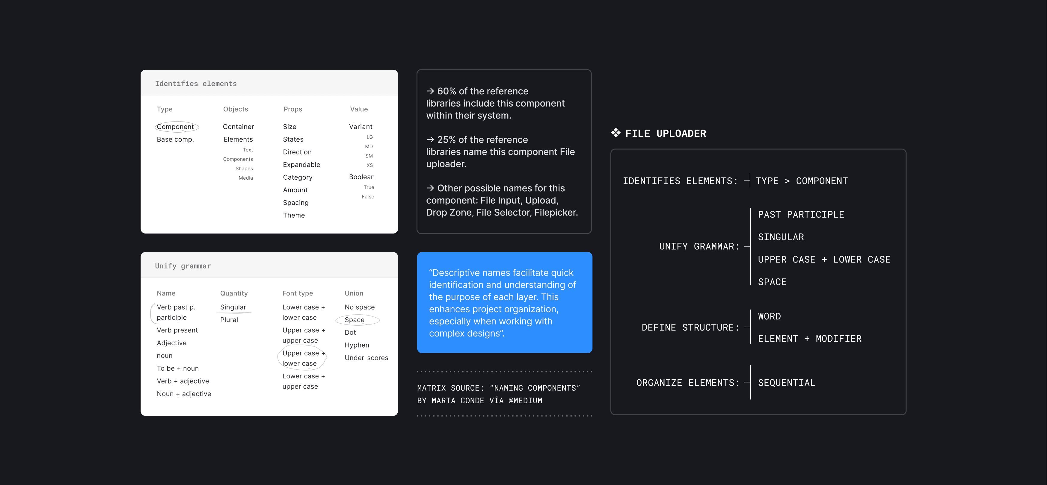
Building a new component is about seamlessly integrating a new piece that aligns perfectly with existing elements and adheres to the same standards. In this part of the case study, we will use the File Uploader component as an example.
Once the properties we will give the component are defined, I start building it using the foundations with a pixel-perfect approach and making use of the functionalities that Figma provides: the use of auto-layout is fundamental to be aligned with the model that will be used in case it is developed, the use of variants to define the states and cases of the component (states, number of files, file loading state), and properties for a better experience for designers, the naming of layers (which I explain in the next title).
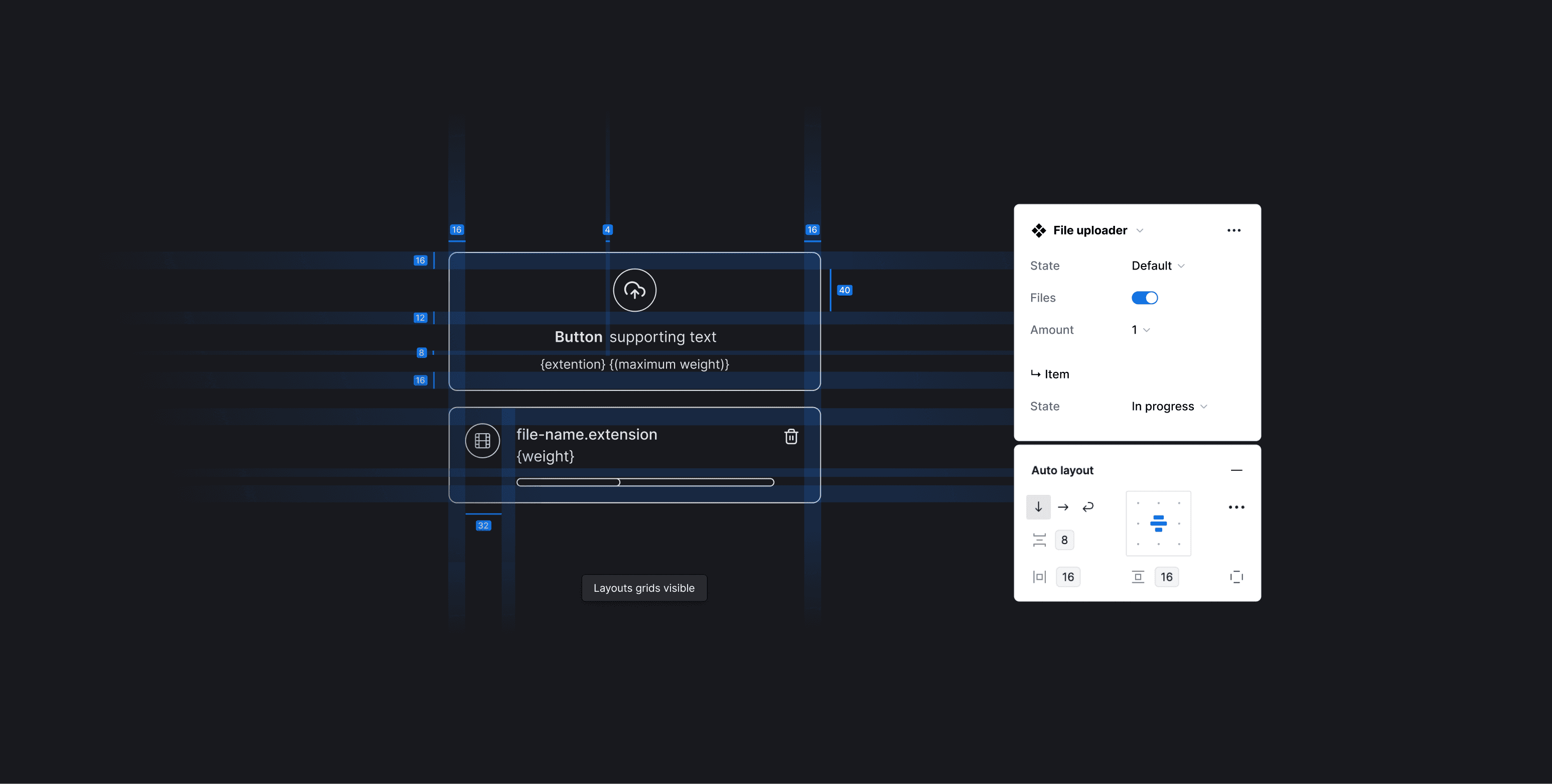
The naming of the layers will improve the findability of the component's elements, such as files or iconography.
On the other hand, the naming of the properties will provide a better experience for users who use this component in Figma, as they will be aligned with commonly used properties.
Finally, how we name the component. I did a brief research on how the File Uploader is called to find what was the most common name for it (25% of the reference libraries name this component File Uploader).
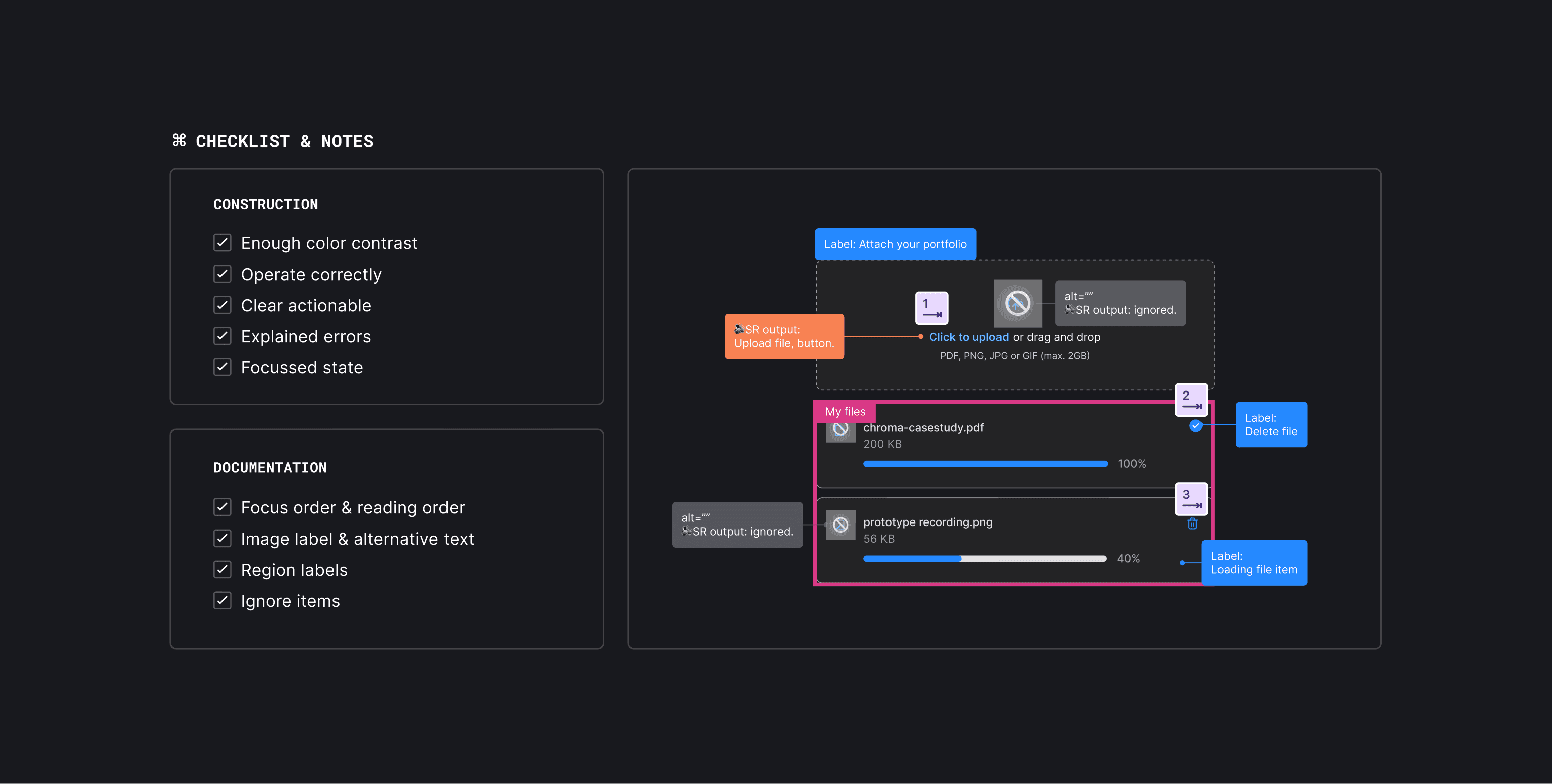
We could make an endless list of reasons to consider the accessibility of a component. But to summarize, we have the responsibility to ensure that the component can be used by all individuals to provide autonomy and independence. Therefore, we must consider doing a contrast checker (link to the page), comply with the accessibility checklist, and document the accessibility notes that the potential developer of this component should consider.
Motion & Interaction

They are building blocks that maintain consistency throughout the entire experience while ensuring the flexibility needed to adapt to any component and its context. These building blocks are based on 3 pillars:
Easing: Defines how an animation changes speed over the course of the action. In the real world, objects tend to accelerate and decelerate as they move.
Duration: Durations should take into account the complexity of the element being animated and the scale of the motion (micro or macro animations).
Effects: Effects are the key to turning components from static to interactive and keeping UI elements alive.
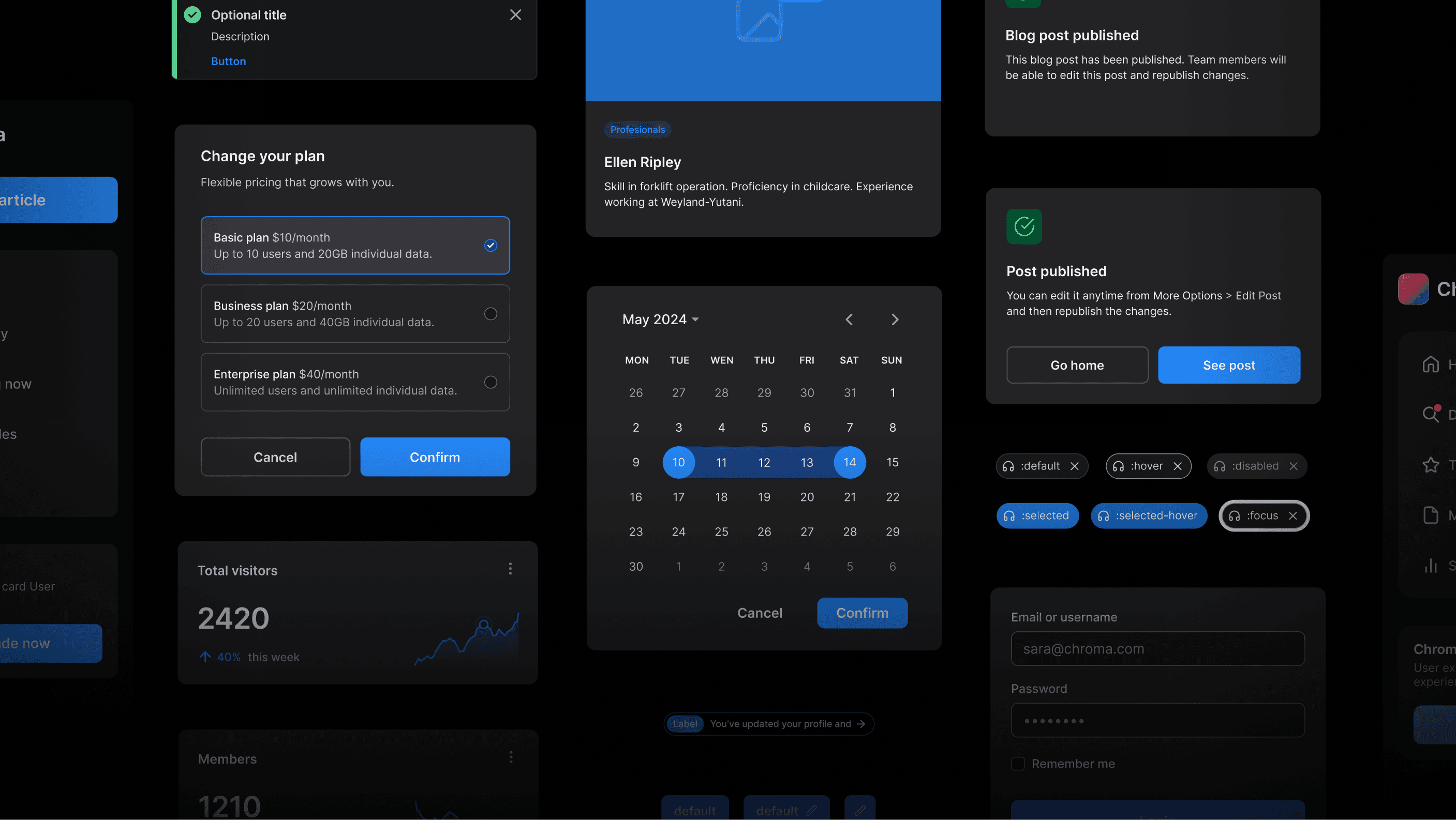
Many of the library's components use Figma's interactive components functionality so that designers can save time when prototyping their designs. In this way, a component comes with its pre-animated interactions.
At this stage, I also did a check of which components would require a Reduce Motion function that allows disabling or reducing the animation present in a component for neurodivergent people who could be harmed by the experience.


Documentation & Maintenance

Artificial Intelligence for Documentation
We use ChatGPT to create documentation incorporating industry best practices, following the style of renowned Design Systems.
Our role as design system designers involves creating new processes and optimizing the time spent on tasks for other designers. AI can speed up laborious and routine tasks to such an extent that it allows us all to spend more time thinking about innovating and putting our users first. (cite Zeroheight article)
Publishing and the Real Start
Once the library is published, usage metrics will be available. Alongside user feedback, improvements for the components can be identified more effectively.
Continuity is required to ensure the long-term effectiveness of the library, which can be achieved through:
Regular updates
Usage monitoring
Documentation maintenance
Internal & External Communications
Support and training
Conclusions
This was a personal project that I really enjoyed doing, and it allowed me to provide a theoretical framework for everything I had learned about Design Systems through practice in my job. I really enjoyed creating my own product, and I plan to launch it to the market in Q4 2024.