
About Project
Every Design System needs an icon set as part of its ecosystem, so I delved into creating a set of over 600 icons that were designed and componentized to be used across multiple products.
Used by
Every Orbita's
Component
16+ Designers
30+ Developers
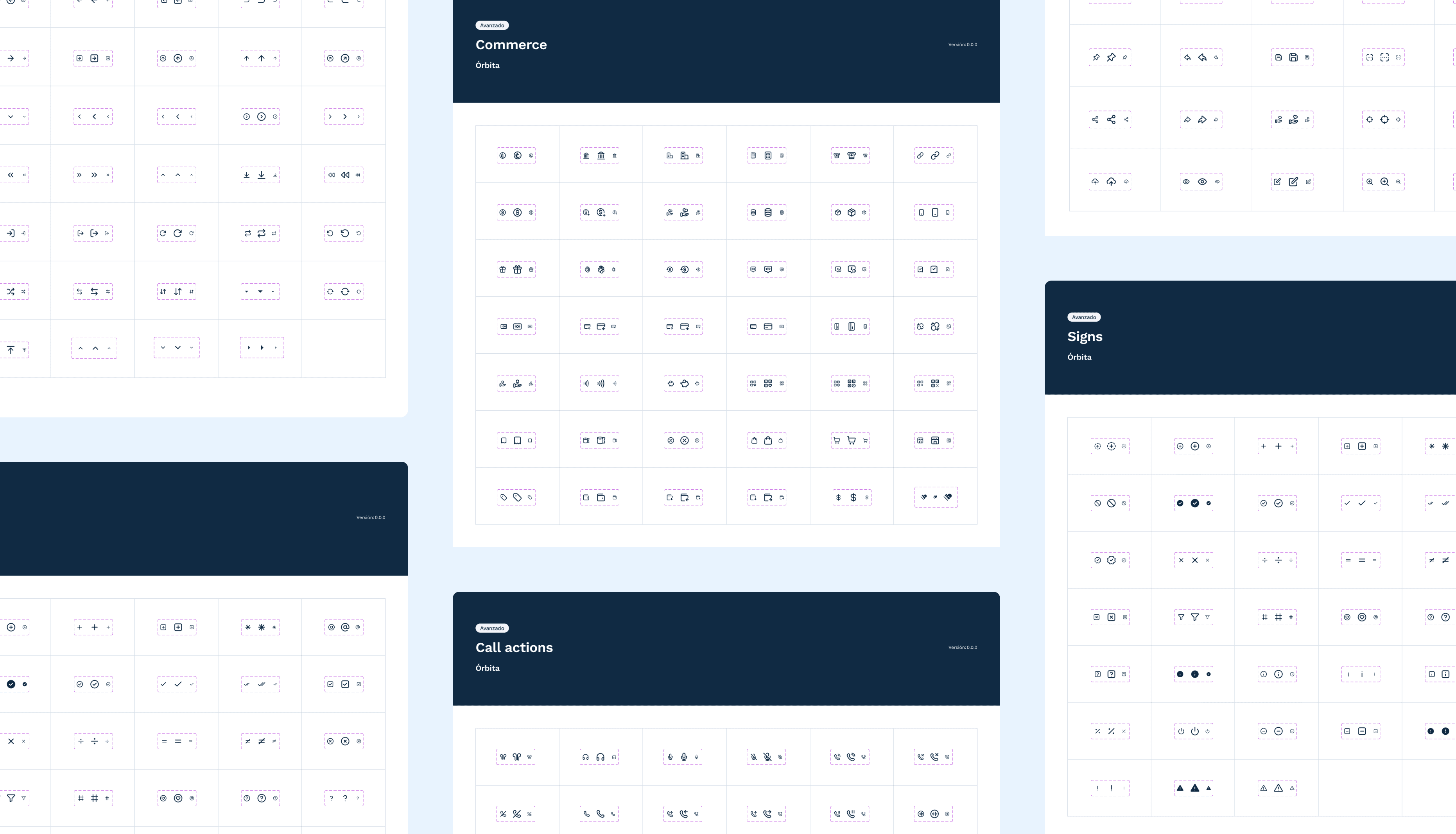
Content
+600 Icons
3 Size Variants
Guidelines
Based in
Figma
Frontend Repo
Duration
4 weeks

Once I had the mapping of the required icons, I did an extensive search for the best free icon libraries on the market. My goal was to have a basic set of editable icons that I could adapt to our needs, thereby avoiding the manual work of creating each icon from scratch. Once I found the set, I made sure the visual language aligned with the visual north star we were aiming for with the product.
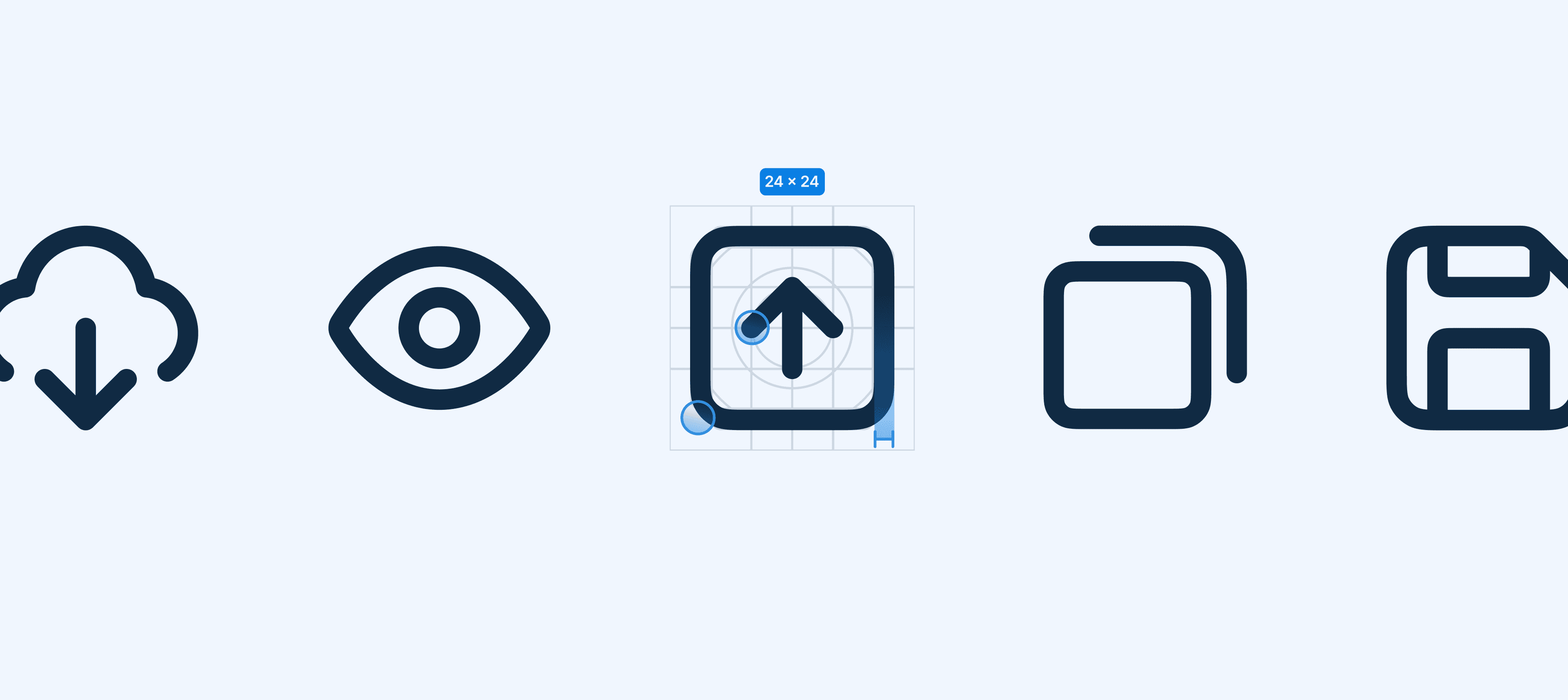
Now for the fun part. I componentized the icons and generated size variables.
16px: The smallest size, used for lower-hierarchy elements that serve as accompaniments.
24px: The size generally used within components. This is the default size from the library, as it's the most commonly used.
32px: This size is typically used as ornamentation in designs with iconography, such as cards or feedback screens.

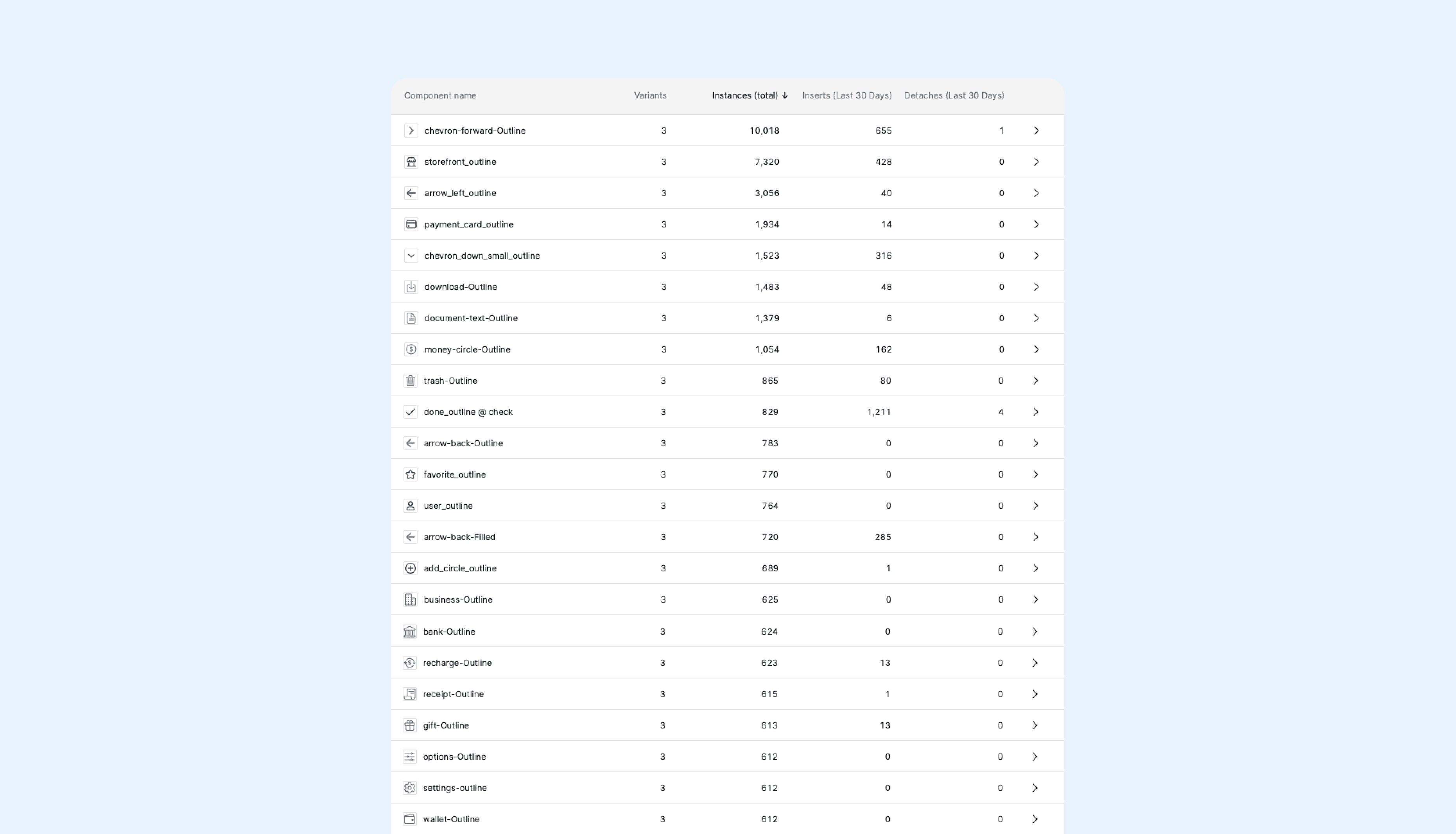
This library was used to build all the components of the Orbita Design System, and continues to be used today.
It improved the visual quality of the products by unifying the style and morphology of the icons used.
It improved the findability of icons in the Figma library.
It helped define an organized handoff to the development team.


